When it comes to utilizing colors in event design and decor, opposites attract! At Art of the Event, we often use complimentary colors in our lighting and displays to help shape a space and define a mood.
Let’s say the main color for your next event is blue – a great, versatile color. You pick out the navy linens, set up some blue-tinged lighting, and order your hydrangeas and forget-me-nots. But it all seems very flat – nothing really stands out in your sea of blue. Then you add some golden orange accents and the scene comes alive!
These are complementary colors – they bring out the best in each other. Blue is cool and inviting, while orange is warm and exciting.
We organize colors using a color wheel, which places colors in a circle according to the spectrum. Complementary colors are positioned opposite on the color wheel: red complements green, yellow complements purple, and blue complements orange. Colors can set a mood and make us feel a particular way, and complements enhance that by providing depth.
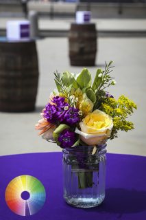
AOTE floral for pharmaceutical company event.
Contrasting flowers bring interest to this centerpiece. The dark purple matches the table, grounding the display, while the yellow appears lighter and springier.
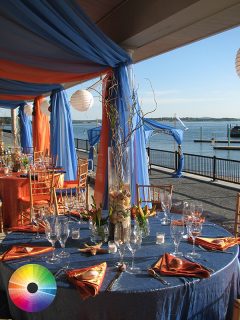
AOTE summer outing Event Design for Planner.
Alternating blue and orange drapery adds visual depth to this seaside party.
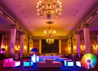
AOTE lighting and furniture for Park Plaza Hotel
We often use lighting to delineate space. Our purple uplighting contrasts with he golden lighting in this hall to create a fun lounge space.
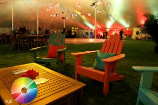
AOTE Outdoor/tent furniture for Planner
Red and green furniture, decor and lighting helps make this tent feel warm and welcoming.
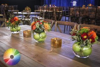
AOTE table and Floral Design for Financial Company Event
Our centerpieces bring a jolt of color to these wooden tables, contrasting the autumn fruit with flowers in shades of red.
For more information regarding choosing a color pallet for your next event, get in contact with one of Art of the Event’s Designers today at 781-670-9292!


